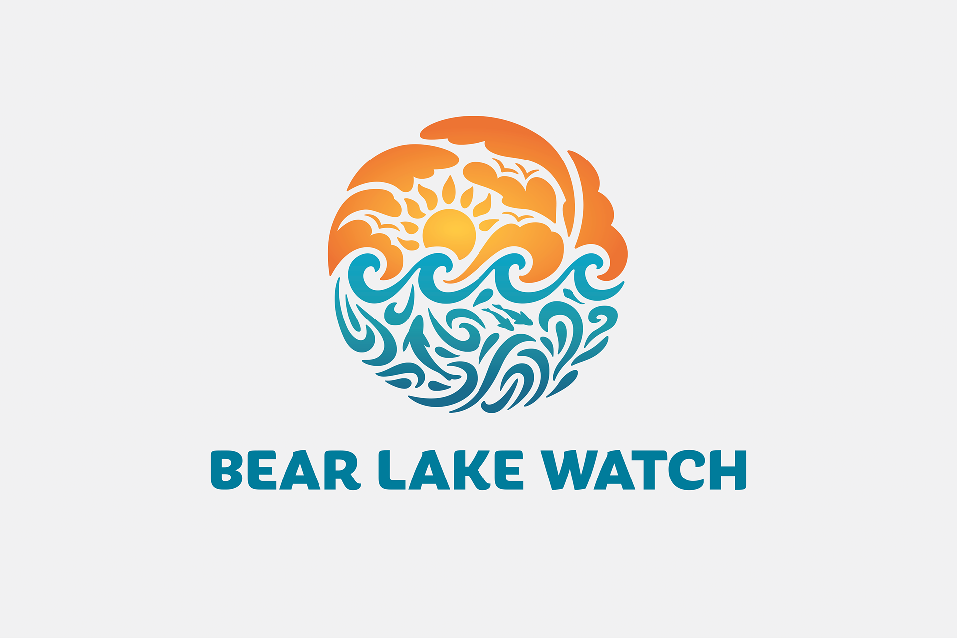
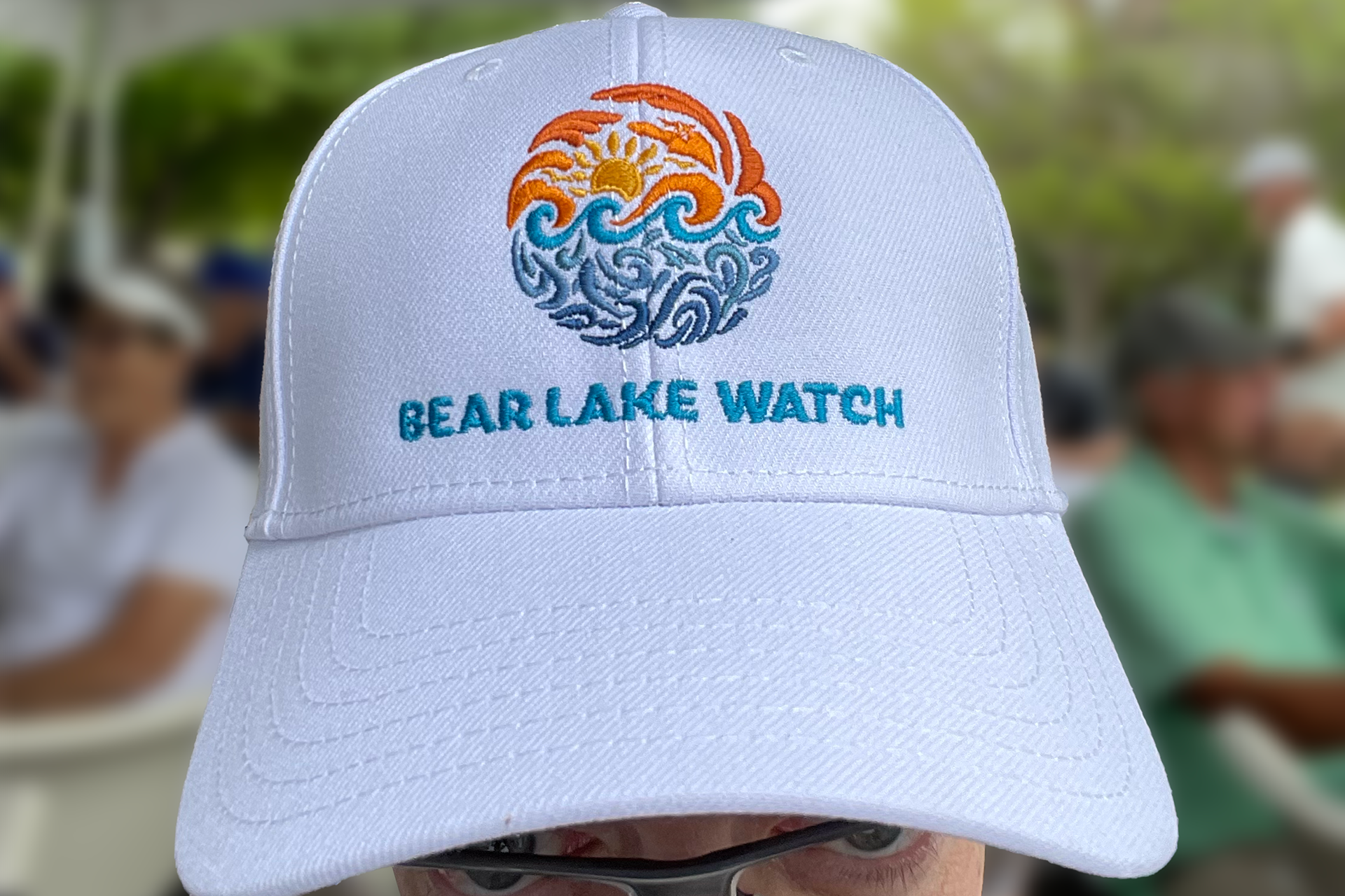
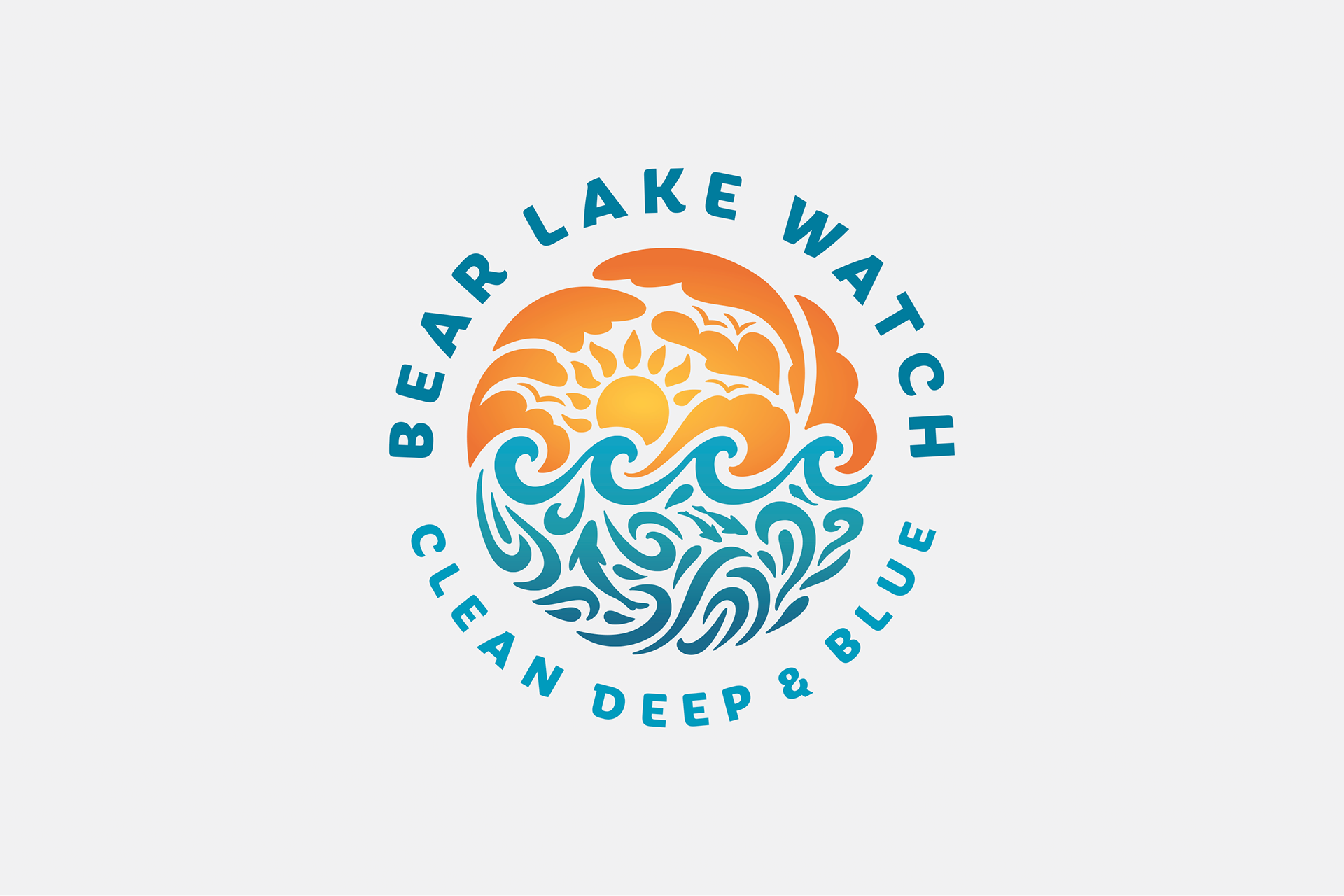

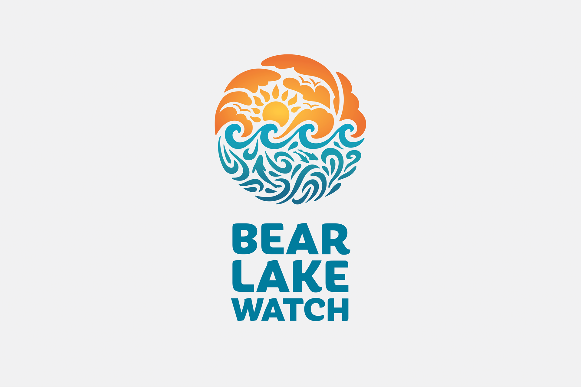
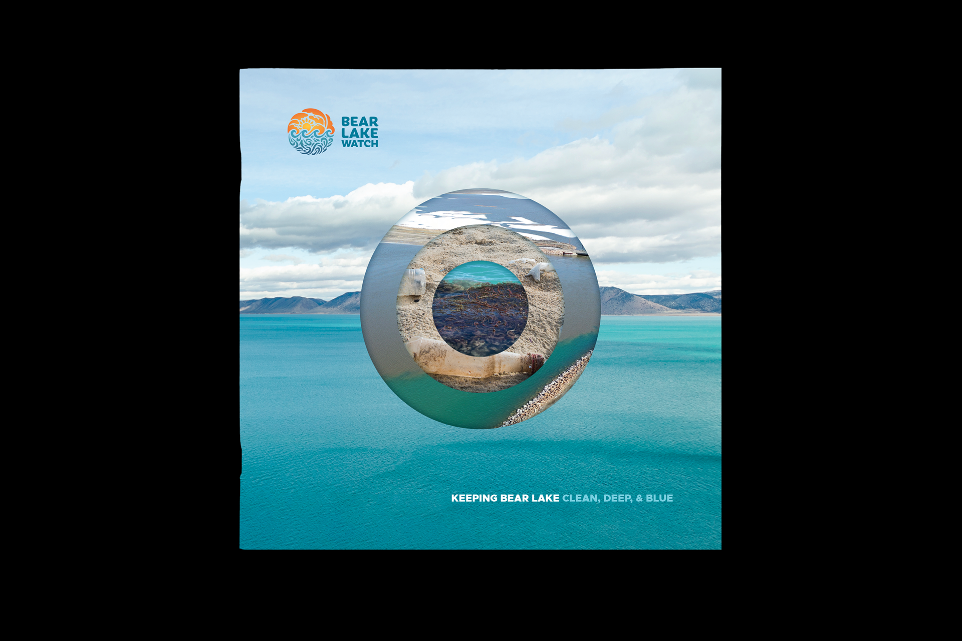
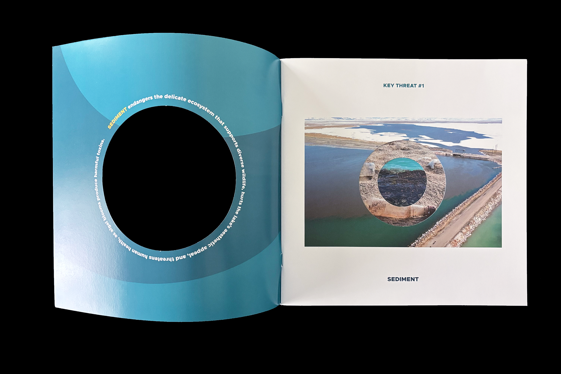
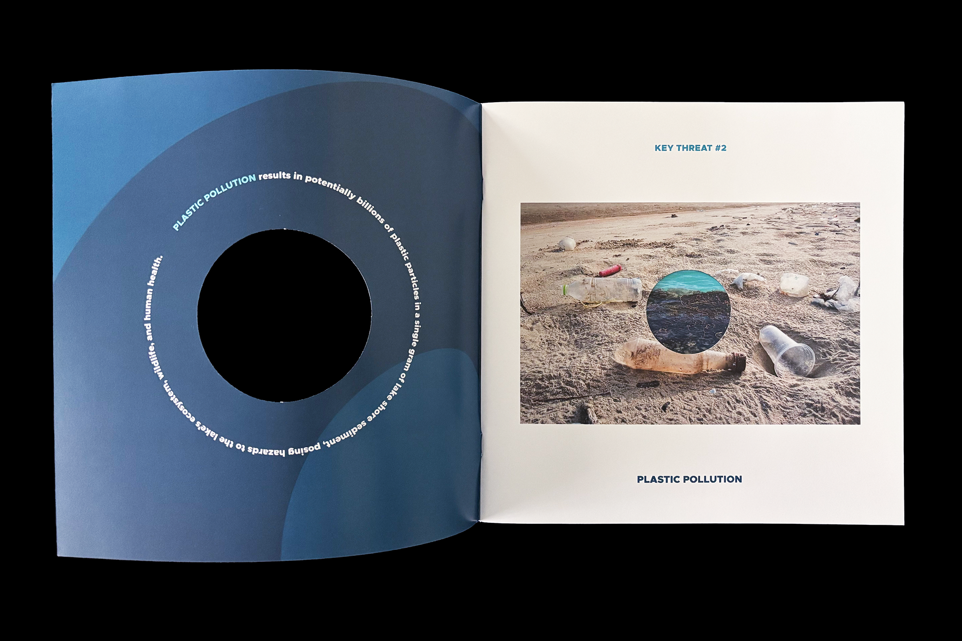
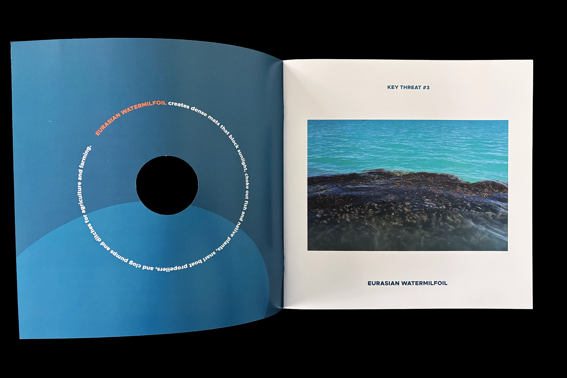
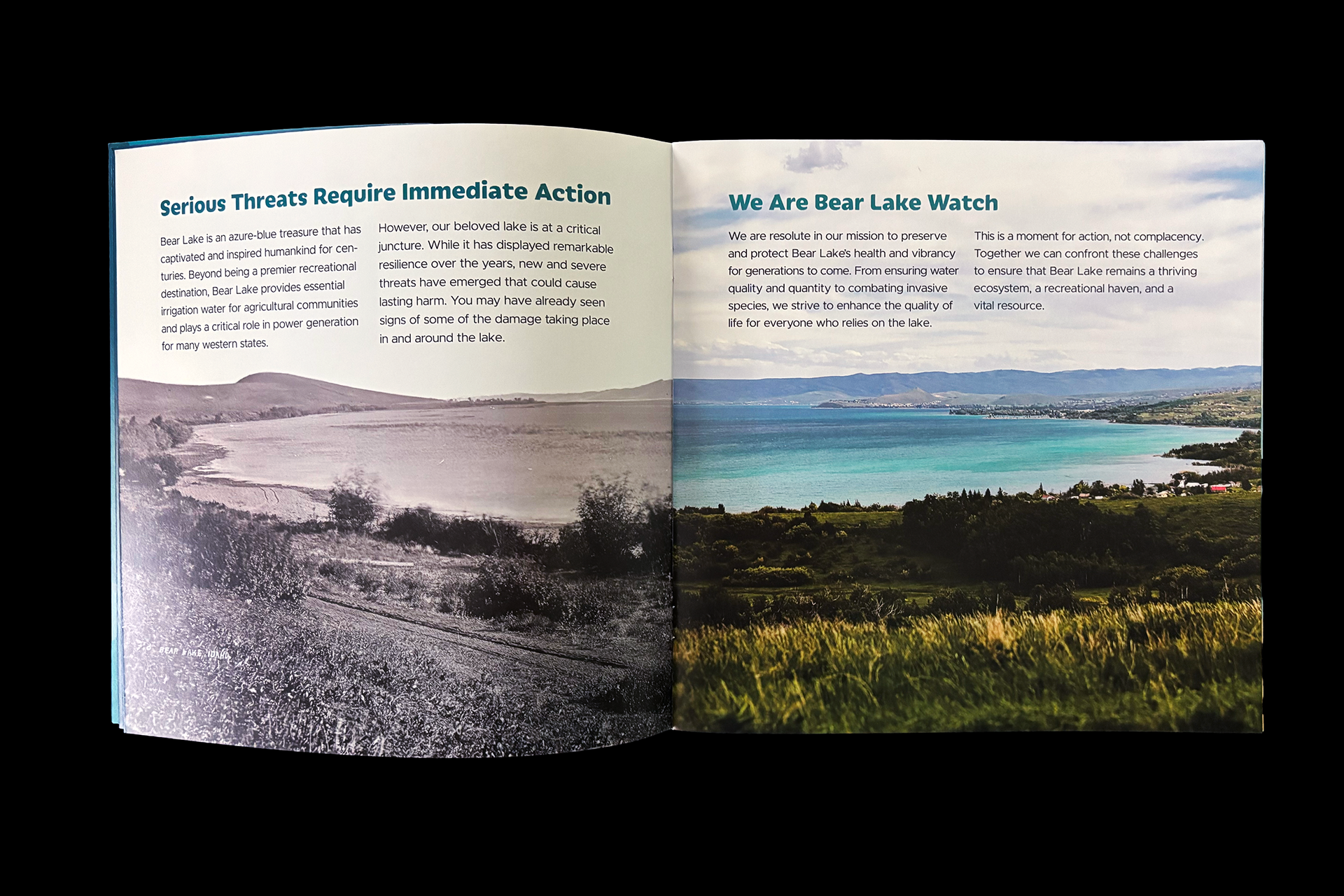
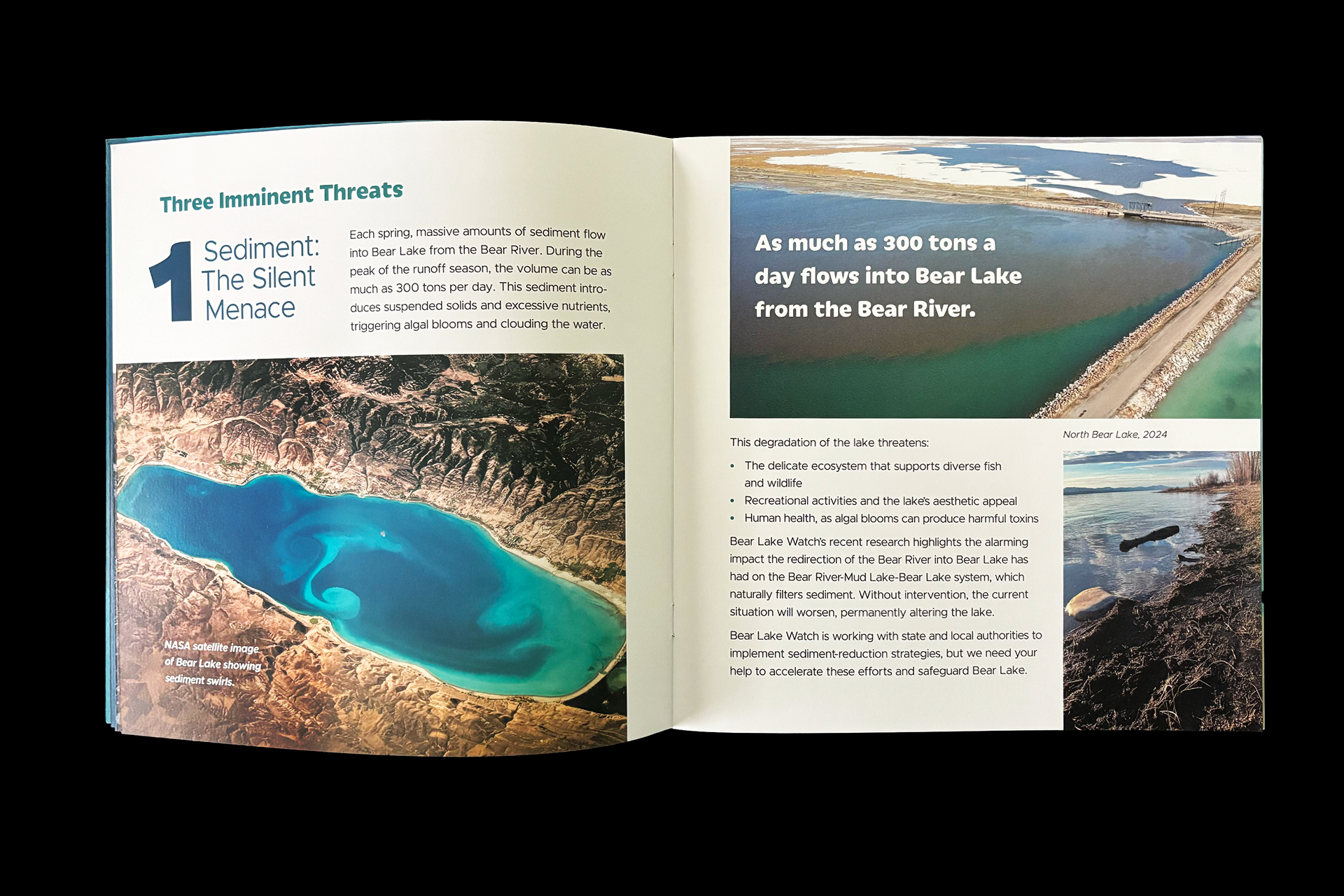
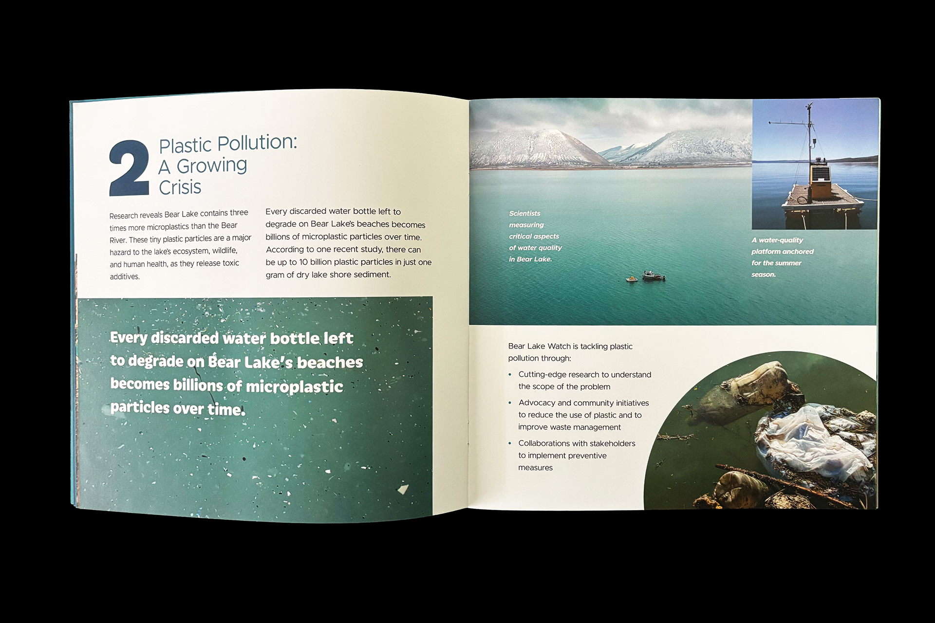

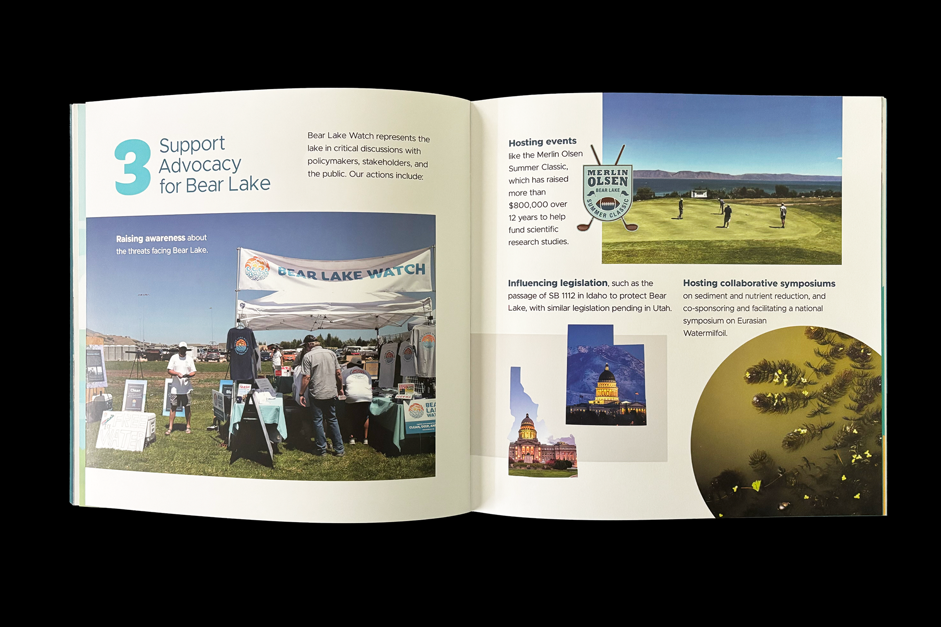
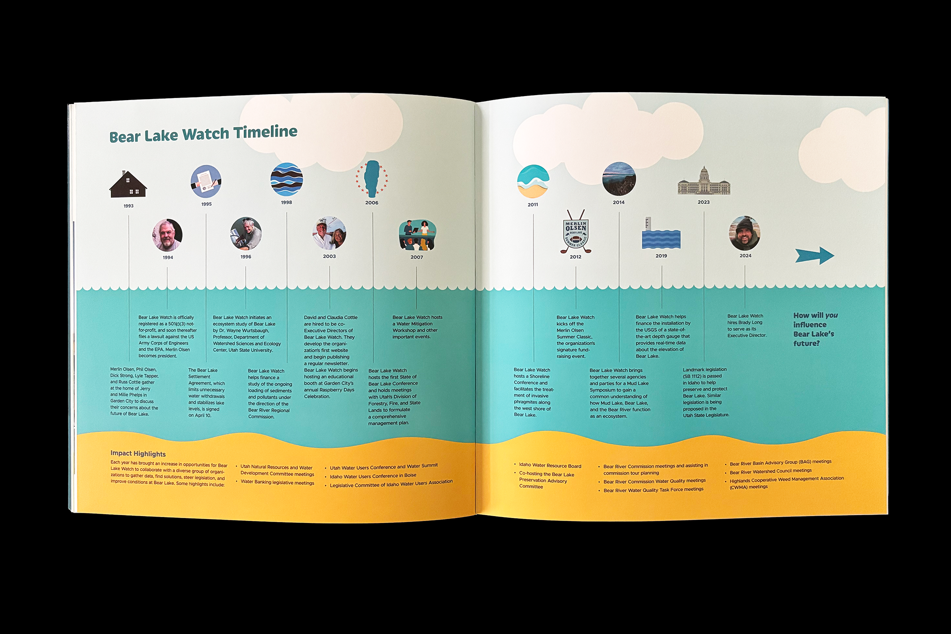
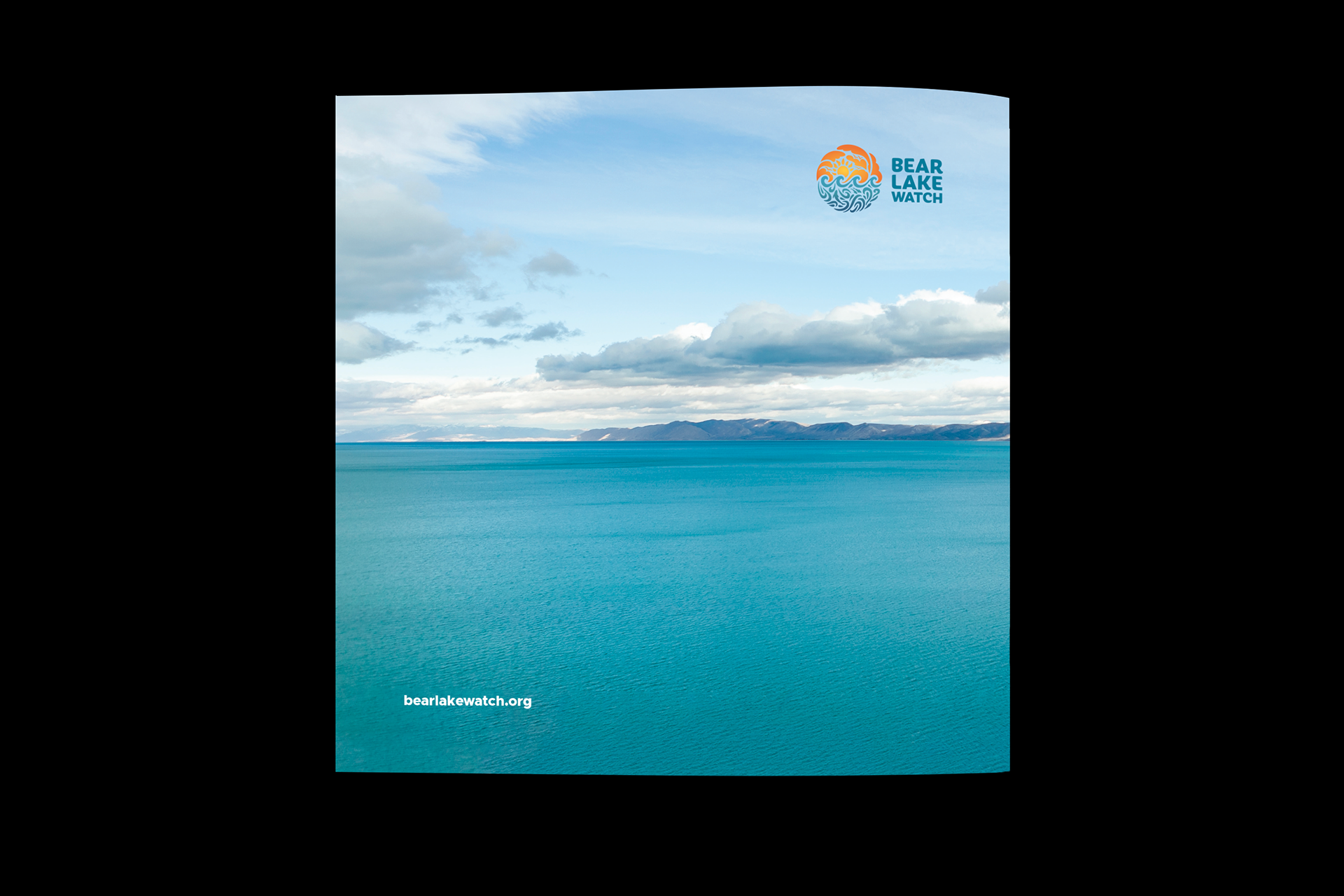
Bear Lake Watch is a non-profit whose mission is to protect and preserve Bear Lake (on the Idaho-Utah border) by keeping it clean, deep, and blue. They hired me to do a complete rebrand of their identity. Illustrator Maria Kim created the beautiful illustration that brought my rough concept to life. The new mark captures the magic of Bear Lake in a unified set of shapes that includes sun, sky, water, and even the four endemic (found only at Bear Lake) fish species. The symbol also preserves a modified version of the wave element in the original mark. Also featured is the mark applied to merchandise. The brochure cover was designed to highlight the three key threats to Bear Lake through die cuts. The interior makes the case for supporting Bear Lake Watch with historical, scientific, and mission information shown by way of multiple infographics. Kelly Olsen was creative director for the brochure and Grant Olsen wrote the copy.